Trending Interior Paint Colors for 2025: Refresh Your Home with These Beautiful Hues
There’s something about a fresh coat of paint that feels like a reset. It’s one of the simplest, most affordable ways to breathe new life into a room. Whether you’re craving a softer, calmer space or ready to bring in a touch of cozy depth, 2025’s trending paint colors offer something for every home.
“The best rooms have something to say about the people who live in them
– David Hicks
Here are the colors designers and homeowners alike are reaching for this year—and a few reflections to help you choose the perfect hue for your next refresh.
1. Warm Earthy Neutrals
Beige, taupe, clay, and creamy mushroom tones are making a strong return. After years of stark whites and cool grays, many people are craving warmth and comfort. These earthy neutrals create a grounded feeling, making living rooms and bedrooms feel inviting and calm.
Tip: Pair with textured throws, wood accents, and greenery to create a restful, layered look.
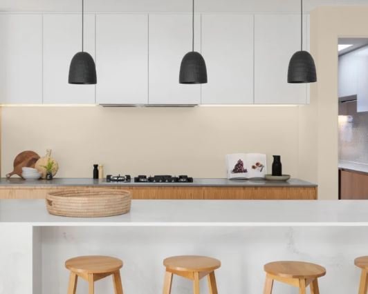
Recommended Colors:
-
“Natural Cream” (OC-14) – a warm, creamy beige that feels cozy and soft.
-
“Manchester Tan” (HC-81) – a classic, versatile tan with subtle warmth.
-
“Edgecomb Gray” (HC-173) – a perfect greige leaning warm without yellow undertones.
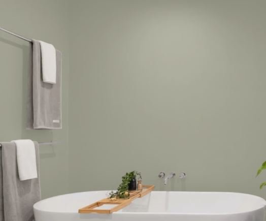
2. Soft Sage and Olive Greens
Greens continue to trend, especially muted sage and soft olive tones. These colors bring the soothing presence of nature indoors and work beautifully with natural wood furniture, rattan accents, and neutral linens.
Where it shines: Bedrooms, bathrooms, or any space where you want to feel peaceful and connected to nature.
Recommended Colors:
“Saybrook Sage” (HC-114) – a calming sage green with muted depth.
“October Mist” (1495) – Benjamin Moore’s 2022 Color of the Year, a gentle, silvery sage that remains on trend.
“Dry Sage” (2142-40) – a sophisticated olive-leaning sage with earthiness.
3. Muted Blues and Blue-Grays
If you’re seeking calm and clarity, soft blue-grays and muted denim blues remain timeless choices. These shades create a serene atmosphere and reflect light beautifully without feeling cold.
Ideal for: Bedrooms, bathrooms, and cozy reading corners.
Recommended Colors:
“Silver Gray” (2131-60) – a soft, airy blue-gray perfect for bedrooms.
“Boothbay Gray” (HC-165) – a balanced blue-gray that reads neutral and calm.
“Breath of Fresh Air” (806) – a light, muted blue with a hint of softness, ideal for bathrooms.
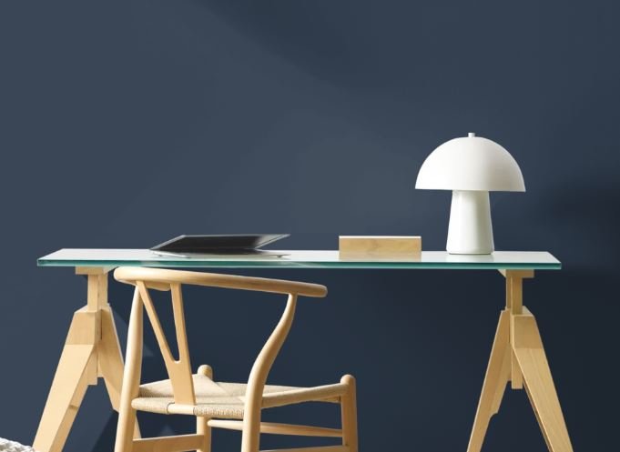
4. Moody Charcoal and Deep Navy Accents
For those ready to embrace a bit more depth, charcoal grays and deep navies are perfect accent colors. They add sophistication and drama without the starkness of true black. Consider painting a built-in bookcase, kitchen island, or even an entire powder room for a cozy, cocooning effect.
Pair with: Warm metallics like brass or gold for an elegant contrast.
Recommended Colors:
“Hale Navy” (HC-154) – a rich, classic deep navy with elegance and warmth.
“Kendall Charcoal” (HC-166) – a deep, moody gray that pairs beautifully with brass fixtures.
“Wrought Iron” (2124-10) – an almost-black charcoal that feels dramatic yet soft.
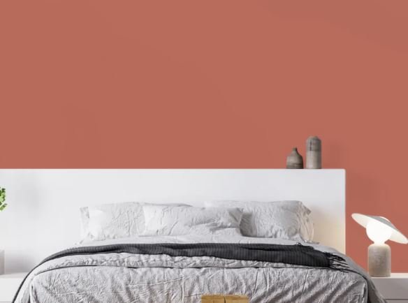
5. Warm Terracotta and Dusty Rose
If you want to add a touch of richness and warmth, earthy terracotta and muted dusty rose tones are trending this year. They feel cozy and lived-in, like a soft woven blanket wrapped around your walls.
Beautiful in: Dining rooms, home offices, or entryways to create an inviting, welcoming feel.
Recommended Colors:
“Rustic Brick” (2091-10) – a warm, earthy terracotta perfect for accents.
“Rosy Peach” (2089-20) – a muted dusty rose with depth and warmth.
“Wild Flower” (2090-40) – a beautiful terracotta-rose hybrid, rich yet inviting.
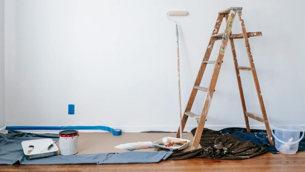
Tips for Choosing the Right Color for Your Home
Before buying a gallon, consider these small steps:
- Test large swatches on different walls. Observe how the color changes in morning, afternoon, and evening light.
- Align with your furnishings. Consider your existing rugs, artwork, and furniture tones to create a cohesive palette.
- Start small. Try a powder room or an accent wall before committing to a full-room change if you’re hesitant.
Color is powerful. It sets the mood, defines the space, and subtly shapes how we feel in our homes. Choosing the right paint color isn’t about following trends blindly—it’s about finding the hues that make you feel comfortable, nurtured, and at ease in your space.
If you could refresh one room in your home right now, which color would you choose? Share your thoughts in the comments below—I’d love to hear about the cozy transformations you’re dreaming of this season.
Create a space that reflects who you are and how you want to feel each day.
– Kate
Real life, real experiences. Share your wisdom, your wins, or even the mess — because life after 50 is worth talking about.